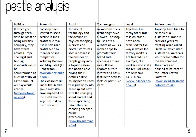
My report initially started out very black and white as I wanted to keep the overall look very simple and to fit in with the logo of Topshop as this would have a prominent feature throughout the report. However, my feedback suggested that I should add some colour throughout to try and soften the overall look and make it look less harsh. Also, by adding more colour it would make it more in tune with the brand, as Topshop is aimed at the younger generation so adding colour would make it seem more fun and youthful. I originally had just a black and white table for my PESTLE and SWOT Analysis as well as for the customer profile and the marketing mix. However, in order to make this more visually appealing I added colour to the table and used the same colours for all of the tables and the graphs in order to still stick to a theme but make it suit the brand more than black and white. Also, I initially had the text at size 20,...


